Brand Identity Design in Ottawa: Building Marks That Outlive Trends
A studio's guide to brand identity design in Ottawa — what makes a mark durable, what makes it dated, and how to commission an identity system you'll still want to look at in ten years.
A logo is not a brand identity. A brand identity is not a brand.
This sentence trips up most Ottawa SMBs commissioning their first serious identity. The vocabulary matters because the price tag matters:
- Logo: a single mark
- Brand identity system: marks, type, colour, motion, image, voice — and the rules connecting them
- Brand: the full perception of your company, of which identity is one input
If you commission a logo expecting a brand, you'll be disappointed. If you commission an identity system expecting a logo, you'll overspend. This piece is about the middle: doing identity correctly.
What an identity system contains
A well-built identity system in 2026 typically delivers:
- Primary, secondary and contextual marks (favicon to billboard)
- Custom or carefully licensed typeface system — display, text, mono
- Colour system — primary, accent, neutral, semantic — defined in OKLCH and HEX, AAA-contrast tested
- Photography direction — composition rules, lighting, mood
- Illustration / iconography system if relevant
- Motion principles — how the brand moves on web and video
- Voice & tone — how the brand talks, in EN and FR
- Application library — stationery, deck, web, signage, packaging
- Brand book — the manual that lets future teams use the system without you
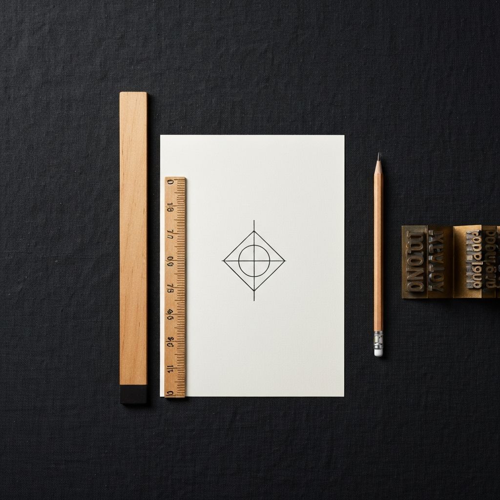
What makes a mark durable
The marks we still look at twenty years later share traits:
- Geometric clarity — they survive being rendered in 16×16 pixels
- A single conceptual idea, not three
- Restraint in colour — usually one or two
- Tension between simple form and personality — perfect circles bore, broken circles compel
The marks that age badly share the opposite: gradient flourishes, era-specific typography (the 2010s "geometric sans," the 2020s "wonky display"), trend-of-the-month colour, mascots that aren't core to the business.
The Ottawa context
Ottawa brands play in three temperatures simultaneously:
- Federal / professional — institutional gravity required
- Tech corridor (Kanata, Bayview) — modern but not cliché
- Hospitality / lifestyle — warm, considered, not corporate
A correctly designed Ottawa identity navigates these temperatures intentionally. Too federal and you can't sell coffee. Too lifestyle and you can't win a procurement.
How long it really takes
A serious Ottawa brand identity engagement:
| Phase | Duration |
|---|---|
| Research & strategy | 3–5 weeks |
| Design exploration | 4–6 weeks |
| Refinement & system build | 4–6 weeks |
| Application & rollout | 4–8 weeks |
| Total | 15–25 weeks |
Anyone promising a complete identity system in three weeks is selling templates.
Common mistakes by Ottawa SMBs
- Designing the logo before the strategy
- Crowdsourcing on 99designs and expecting cohesion
- Using stock photography forever (this kills more brands than bad logos)
- No bilingual application work — the wordmark looks great in EN, terrible in FR
- No motion principles — the brand sits dead online
- No accessibility audit — failing AA is a brand failure now
Where the system pays for itself
A correctly built identity:
- Reduces design production cost 40–60% over five years (everything follows the system)
- Lifts conversion 10–25% on the website
- Reduces sales cycle in B2B by 8–15% (customers trust faster)
- Pays for itself in recruiting alone over 24 months
Working with Blake & Watt
We commit to no more than six identity engagements a year. Every piece is built to look correct in 2036. If you'd like to see private case studies, reach out — and meanwhile, our studio guide is the right place to start.
Related reading: